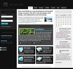
There are some things I really like about this design, including the calendar, news items and client extranet login. What I don't like is the very low contrast logo and the lack of any sort of rollover on the navigation. Nice design overall though.
newlookmedia.com
15.8.07
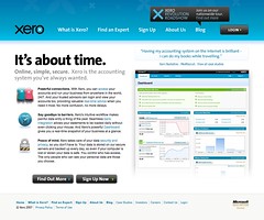
Inspiration: Xero
Inspiration: Xero
Xero's online accounting system looks attractive, simple and fun to
use. So it's no surprise that the website they use to promote their
software should be the same. I love the great use of typography in
the headings as well as the playful use of icons, screenshots and
subtle glossy effects.
www.xero.com/nz/
9.8.07
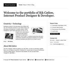
Inspiration: Rikcat Industries
Rik Catlow is not only an amazing artist, which can be seen through
his personal website, but he's also
a great designer. Again, simplicity and content win out in this
site's design, especially since there is almost no color whatsoever
here. The typography and subtle lines makes this one a favorite of mine.
www.rikcatindustries.com/
Uploaded by Patrick Haney on 24 Jul
Inspiration: Doug Dosberg
Doug's personal site is big, bold and fun, like any personal site
should be. The huge header really stands out and gives the design a
life of its own. I really enjoy the giant search box, the great type,
and the footer section as well. The only thing that bothers me about
this design is the drop down navigation tab, which seems much too
hidden to me.
dougdosberg.com/
8.8.07
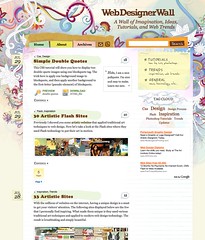
Inspiration: Web Designer Wall
There are some truly artistic designs for the web out there, and this
is one of them. Some might say this site is too busy, but I really
enjoy the freshness of the illustrations surrounding the content
area, as well as some of the other nice design elements on the page.
http://www.webdesignerwall.com/
is one of them. Some might say this site is too busy, but I really
enjoy the freshness of the illustrations surrounding the content
area, as well as some of the other nice design elements on the page.
http://www.webdesignerwall.com/
Subscribe to:
Posts (Atom)